
 |
The Internet's Largest and Fastest Growing Engraving Community
Discuss hand engraving using basic to the most advanced methods and equipment
Forum Members: 14,761. Welcome to our newest member, AnicaLin
EngravingForum.com -
Domain since Feb 7, 2003
 Graver Video Conferencing is empty Join now!
|
|||||||
| ENGRAVING TOOLS - Paypal accepted | Classes | Glossary | Feedback | Tips | Sharpening | Bulino | Videos | Forum Policies |
 |
|
|
Thread Tools |
|
#1
|
||||
|
||||
|
(If you would like to comment on this submission, you may do so by posting a reply in this thread. Thanks! Kaitlin)
Hi all, I have decided to give this contest thing a bash and will be putting myself up for scrutiny, and quite possibly total ridicule, in the art of lettering. I've decided to engrave a plate in copper in the style of old 'trade labels' - to see my flickr photos click here. 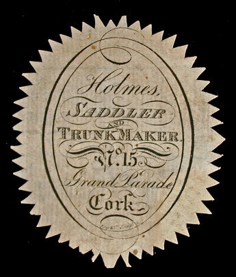 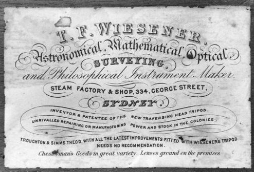 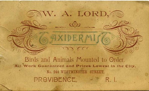 It will be engraved in reverse so that if I don't totally screw up I will find someone with a press and print it as my business card! Wahey. lets hope I can find the time to get it all done by December. |
|
#2
|
||||
|
||||
|
Hi All,
Well I'm getting started at last after a pretty busy week. So apologies for keeping you all in suspense (assuming you actually are interested!). As this is my first attempt at this I thought I would start by explaining about myself first. I trained in Cape Town, South Africa, as a jeweller and then moved to England to work as a jeweller. After doing a part-time course in engraving I decided to switch career and got work as a 'trade' engraver in London where I worked for 4 years until I went self employed about a year ago. SO in theory at least, I should be pretty good at lettering, as that is mostly what I did for 4 years. But I have been doing more pictorial stuff, so I'm a bit rusty and thought this would be a good way of getting back into lettering. About the tutorial: Firstly I am going to assume that no-one knows about lettering, so please don't feel patronised if I keep it simple. Where necessary I may also include a glossary of English terms so that you Americans can understand what I'm on about. Perhaps I can teach some of you the Mothertongue while I'm at it ![Smile[2]](/images/smilies/top smiles/smile[2].gif) I am going to cover the 4 main letter styles and aim to explain a bit about each one as I go along: Roman Script Old English/Gothic Block/Sans Serif OOH and one last important note. I am left handed and I'm not going to attempt reversing my explanations for you rightys. So remember if I say up it means down in right-handed speak. And lastly may I just say I LOVE TYPOGRAPHY! |
|
#3
|
||||
|
||||
|
The Music: Death Cab for Cutie, Lambchop, Laura Veirs
The Drink: Coffee The Weather: London Miserableness The Mood: Perky (due to coffee not weather) Essential Design Tools Sustenance  .5mm pencil ruler plain white A4 paper tracing paper eraser copies of font to be used for reference set square sticky tape  Layout I’ll be engraving a copper plate, the print of which will be the size of a business card. Measurements: 85mm x 55mm Initially I drew a rough design that was 2:1 but from now on I will be working on a 1:1 scale as it is all too easy to draw a nice looking letter in a larger size only to render it illegible when reducing down to the actual size. Here are two variations of my 2:1 design ideas (not final). 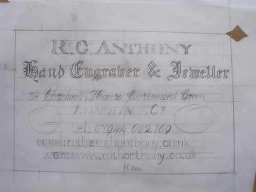 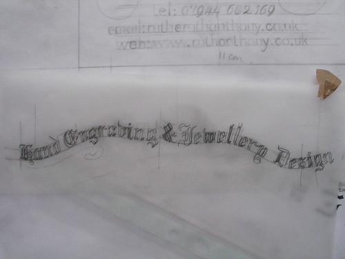 On a piece of white paper I have marked out a template of the business card. Then I marked out halfway points and a border. 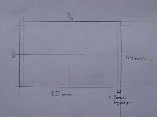 I placed the tracing paper over this template stuck it down with tape so it doesn’t move about and now I can start laying out the letters on the tracing paper with the template as a guide underneath it. This way if I mess up I only have to re-draw the lettering on a new sheet of tracing paper and not the whole template. 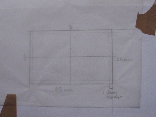 Now I'm ready to get drawing. |
|
#4
|
||||
|
||||
|
The Subject: Roman Lettering
The Music: Film Soundtracks - Kill Bill, The Royal Tenenbaums, Romeo and Juliet (Baz Lurman version) The Drink: Water - re-hydrating after all that Coffee The Weather: A Dark and Stormy night The Central Heating: ON Roman The basis of all Roman type is founded on this Trajan Column base. Its a classic!  Here is another Roman font very similar to the one above.  Marking out Roman Lettering The following can be applied generally to all lettering Count the number of letters to be engraved remembering to count spaces as well. I am engraving R.C. Anthony, which equals 10 units. I dont count full stops but just keep in mind that there needs to be a bit of extra space for them. Divide the number in half = 5 So I need roughly 5 letters on each side of the halfway mark so that everything is centred. Its only a rough guess as 'I' takes up less space than 'O' for example. Mark out the height Mark a top and bottom line for the letter heights I am using title case, so the Initials are slightly bigger than the other letters. Mark this line too. 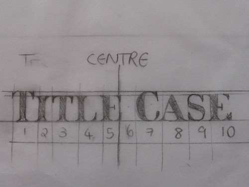 Proportions One can read countless books and articles on lettering proportions. My best advice is to just look at lettering. Obsessively. The next step is to practice drawing it. This is what engravers do anyway. Observe, draw what you see, engrave. Lettering is no different, just perhaps a little less forgiving. By doing this it somehow becomes embedded in the psyche after a time and then it becomes just as natural as drawing a scroll. It's a matter of personal taste, but I like my Romans short and fat. ![Smile[2]](/images/smilies/top smiles/smile[2].gif) Drawing the letters Draw only what is necessary. As the height lines are all drawn in there is no need to draw the arms of the letters.  Draw the down strokes or stems of the letter. To keep the drawing clean and legible only draw one line (as in the second picture down) 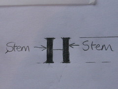 For the most part the drawn line relates to the outside of the stem. An exception to this, for example, is T or I where it marks the middle of the stem. 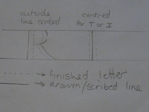 So this is what my drawing for the Roman Lettering looks like  Usefull Links Type anatomy http://www.fonts.com/aboutfonts/arti...ti/anatomy.htm http://graphicdesign.spokanefalls.ed...cs/default.htm GLOSSARY English:Full stop American: Period Arms - Unattached horizontal stroke (as in F or E) The sloping stroke in the letter K would also be considered an arm. Stem A straight vertical stroke (or the main straight diagonal stroke in a letter which has no verticals). |
|
#5
|
||||
|
||||
|
The Music: Alison Krauss and Union Station, Smashing Pumpkins
The Drink: Rooibos tea The Weather: Its dark, who cares The Mood: Procrastination (see below) Well, I should be studying Ancient Hebrew but doing this is arguably: a) easier b) more fun c) I actually have some vague understanding of what I am doing. I think I might be running a risk that you will learn more about me through this tutorial than Engraving. Yikes. That's quite a scary thought. Anyway. Block lettering. First I must salute/bow down/shout aloud "We're not worthy" to my hero Edward Johnston for designing the beautiful and flawless London Underground font. Take a moment if you will, to peruse and admire the following: 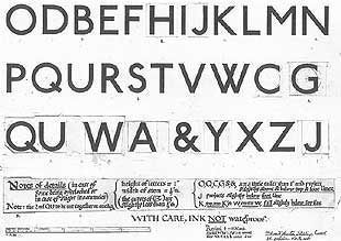  Is it not a work of glorious simplicity and beauty? Yes. Yes it is. If anyone out there has had the misfortune to travel on the London Tube system you will know what a miserable and soul destroying experience it can be. What joy, then, to know that during your journey there is the opportunity to improve your engraving by studying this marvelous typeface. I'm not going to repeat the layout because its pretty much the same method as laying out Roman. (Although I counted the full stops in the web and email address to spread it out and make it more legible). Block tends to be a bit more square than Roman, so the method is the same, but with the necessary changes being made to proportions. Here's what I've done. It's bothering me though because I've got the 'ruthanthony.co.uk' repeated below itself, which is not ideal. 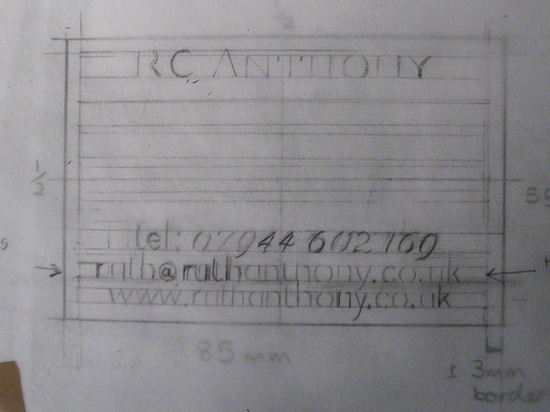 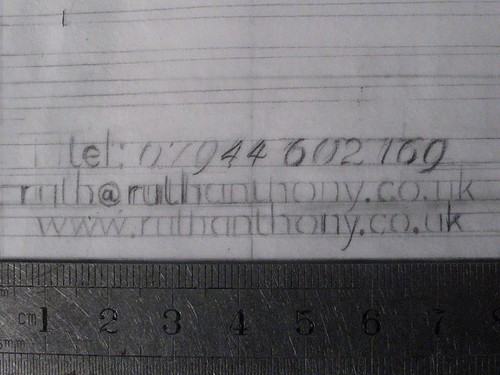 So I tried this as a second option. I am using script numbers because I like the way they look, but am not sure if it will look OK mixing block and script in the same line. Any suggestions on how to improve on this design are welcome. Sorry the pic is a but fuzzy 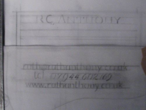 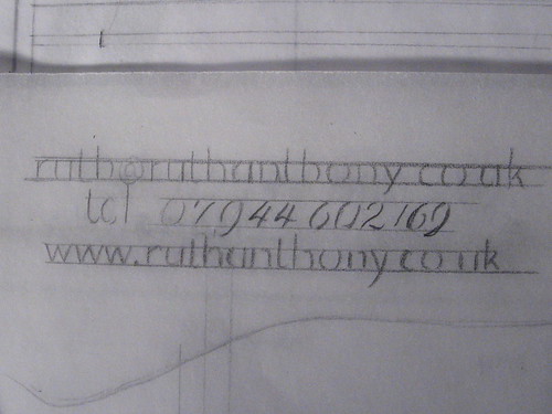 That's it for the moment. Probably won't have time to do more til the weekend now. Links of Interest London Underground font http://www.planet-typography.com/new...derground.html The Edward Johnston Foundation http://www.ejf.org.uk/ejf.html and if you're looking for a laugh http://en.wikipedia.org/wiki/San_Serriffe |
|
#6
|
||||
|
||||
|
The Music: Rob Bell, the Go team, the Man in Black (San Quentin)
The Drink: the elixir of Life, aka Coffee The Weather: Stunningly beautiful sunny Autumn day. Proof the sun does occasionally shine in 'Ingerland'  I have a confession to make. I sat down to write this tutorial more than 3 hours ago and up til now have not typed a single word. I've been surfing t'internet* and found some really cool sites on Penmanship, Script lettering and related subjects. So awesome, in fact, that I feel totally unworthy to even try explaining script when there are resources out there, so readily accessible, which lay things out so much more clearly and in-depth than I, in my limited knowledge and experience, could ever hope to do. So, call me lazy, but may I direct you to the online awesomeness of http://www.iampeth.com/lessons/ where you may discover anything your heart could desire to know about script including:
I would like to give full credit to the site and just draw attention to the fact that there is copyright on the site (though everything on there seems to be freely downloadable), so I am not going to use any images from there in my submission. Before I start, here's the updated design. I scaled down the size of the block letters to make more room. I've added the slanted Roman (London EC1) too. 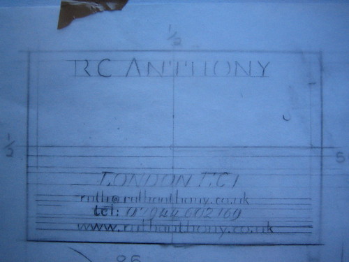 Here follows an outline of the Script that I'm using in my design. I must admit that I find this the most difficult lettering style to master. Basic marking out I use a basic template marking out 60 degree angles as a guide to get the correct slant. I find when drawing that I naturally tend to draw a slant of about 62 degrees. Everyone will have their own natural tendency, but anything between 50 - 60 degrees is good. The 'Line of Beauty' follows this slant. It forms the backbone of the letter, and is the main basic stem for drawing script from which everything follows. 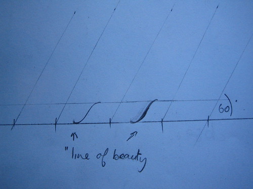 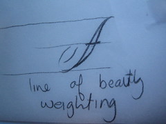 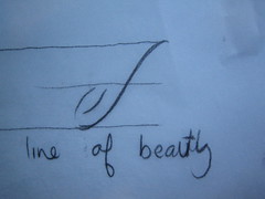 The 'weight' or widest point of the shaded line of beauty should be balanced so that it is heaviest below the centre line. Everything should flow in a graceful manner. Ratios and proportions The main body of the letter (not counting the loops and flourishes) should have an approximate height:width ratio of 2.5:1. When drawing script I usually have an enlarged copy of the following from Meeks book in front of me for reference. I find it really helpful in breaking the letter down into its basic elements and getting the proportions right. 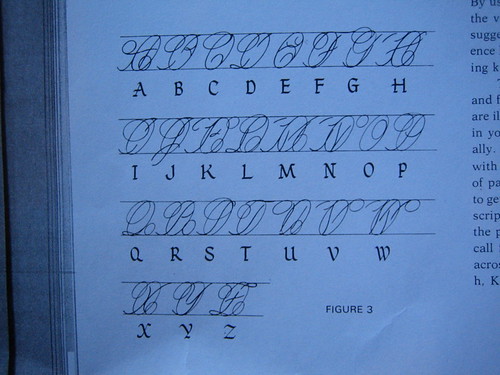 Upper Case in relation to Lowercase is about 1:1/3  Spacing The lower case letters should be spaced quite close together. This is also where drawing on with a single line (as I did with the Roman letters) comes in handy - it reduces the risk of spacing the letters too far apart. There have been a few comments in the forum about using the computer to lay out lettering. The second best reason for drawing by hand is that you can do optical spacing as opposed to Mechanical spacing. Mechanical spacing places the letters equal distances apart, without allowance for the difference in individual widths of letters. Computer programmes fix this problem by using kerning*. If you have Adobe Illustrator you can make all sorts of adjustments to the kerning, tracking etc. That's all great and fantastic, but the first best reason for drawing lettering is because drawing is FUN. Personally, I find typing on a computer to be not as fun as drawing with a pencil. Besides, because of spending my apprentice days drawing endlessly, for me at least, the time-saving factor is not as high as it might be otherwise. Here be the result of my script lettering. I used a .5mm pencil, but as you can see, some of the letters are a bit thick. Unfortunately my .3mm pencil is broken so .5 had to do. It's probably better to use a harder lead, but I like using B. An H lead would probably smudge less and look clearer. 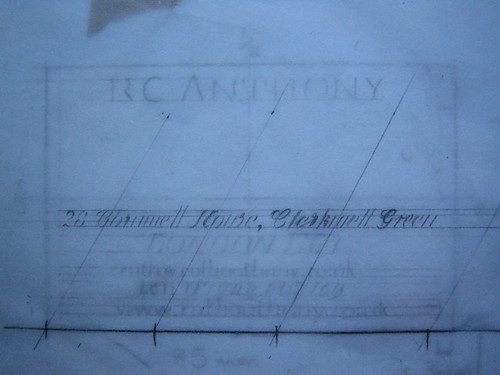 Glossary Tinternet (also written t'internet) is a slang term for the Internet, popularised in the UK by the comedian Peter Kay. The word itself is a Phonetic rendering of how the phrase 'The Internet' is sometimes pronounced in the Lancashire dialect and accent. It is common for such dialects to drop the definite article and replace it with a 't' at the front of a noun. Kerning: a term applied specifically to the adjustment of spacing of two particular characters to correct visually uneven spacing. Links http://www.zanerian.com/ http://www.iampeth.com/lessons.php |
|
#7
|
||||
|
||||
|
The Music: Postal Service, Esbjorn Svensson Trio, Fat Freddies Drop
The Drink: A nice cup of Tea The Weather: Sunny but my toes are frozen The Mood: Sleep deprived grumpiness; cured/exacerbated by cups of tea. Hi all, I hope you haven't given up on me. Its been a busy time, but I've finally sat down to do some tutorialising (a valid word ?). Old English Lettering here we go: In the interests of brevity I wont go into the history of this script but to say that it has Germanic origins and is perhaps best know for being the type used to print Johannes Gutenbergs 42 line Bible - the first book to be produced using movable type.  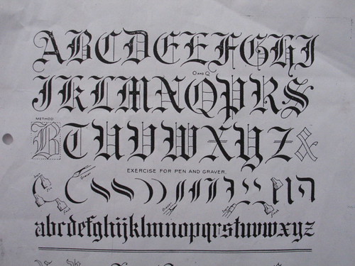 The secret to lettering, I think, is to try to mechanically deconstruct the elements that make up a letter, and understand the basic building blocks that make up a particular alphabet. Once this is done you can build it up again into a legible alphabet. This really helps with Old English, which can look very confusing, but actually is made up of only a few basic shapes. Lowercase first. This drawing shows the three main 'axes' of an OE letter. 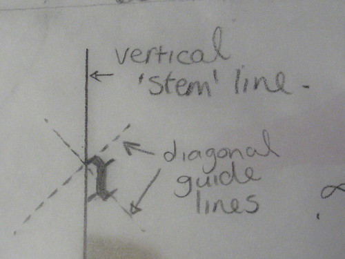 This is what the drawing guidelines look like. 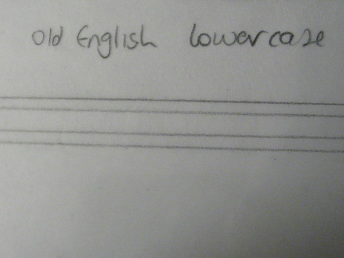 and the letters are pretty much broken down into the following shapes 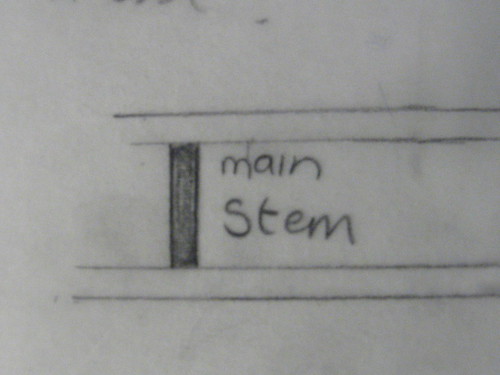 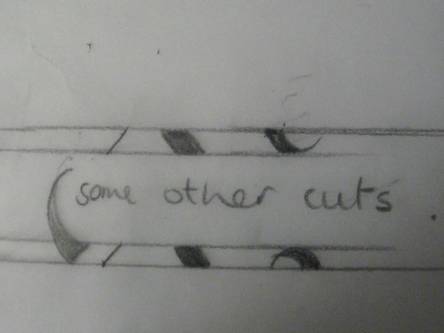 I'll demonstrate how I draw OE with two examples below. The first word is 'and' and the second is 'jewel' First I draw on the main stems - I draw the outline of the stem rather than just a single line like I did with the other lettering styles. I keep the gaps in between stems just about the same as the stem thickness. Width between letters is also about the same thickness as the main stem.  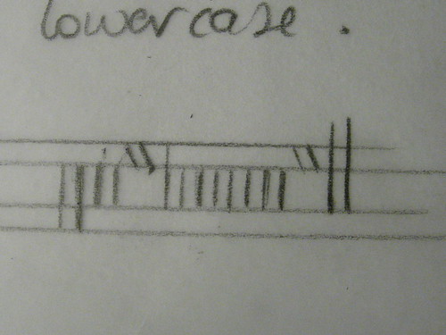 OK It looks very confusing, I admit, but this is what works for me. Fear not! It will start to make sense. I always have a copy of the alphabet in front of me for reference. The next step is to draw in the diagonals and other cuts like the swirly bit for the 'a'   Come on, admit - its starting to look like something now. ermm. Maybe. Next is to draw the hairline diagonals that complete the letter.  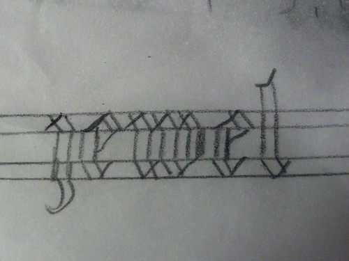 And finally, I just coloured it in, so that you can see the letters more clearly - I obviously wouldn't do this when pointing on to the metal 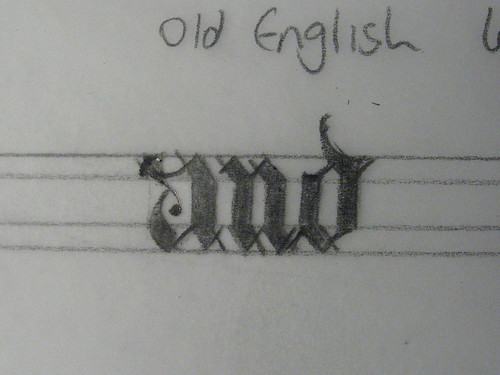 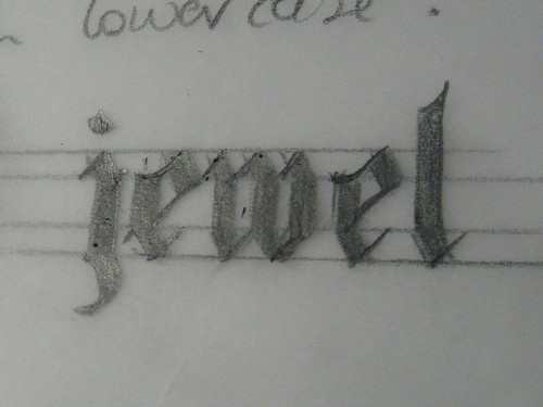 Cool hey! Caps Capitals are between two-thirds bigger and double the height of lower case letters - depending on how much space you have on the area to be engraved. Mine will be closer to 2/3rds. To be honest I dont really have a method that I use for doing the Caps like I do the lowecase. I just take each letter individually as it comes. Still, there are basic elements to most of the Capital letters. I'm going to demonstrate the H, E and J. These are the basic elements 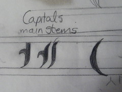 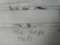 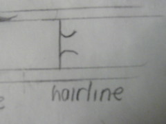 Draw on guidelines, then draw the main stems 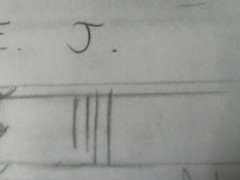  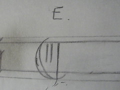 Add in the other diagonals/curves then hairline cuts. 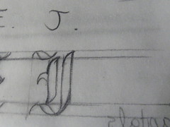 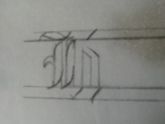 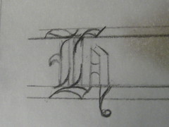 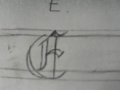 Voila!  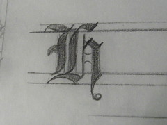 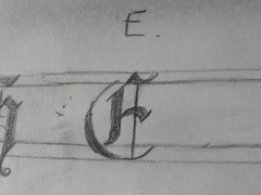 I'll add the drawing for my actual plate later. Right now its time to catch some shut-eye. |
|
#8
|
||||
|
||||
|
Here's a quick post of my drawing for the final plate.
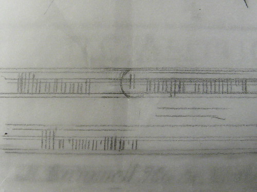 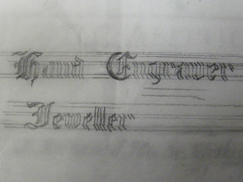 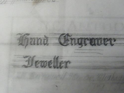 Then I cut it out and tried a few layouts. I haven't decided on the final one yet.  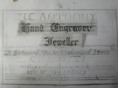 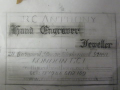 I tried a few flourishy bits too, but I need to give it some proper attention and time. 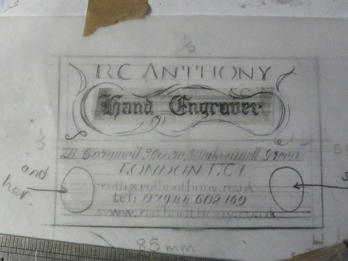 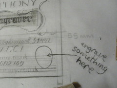  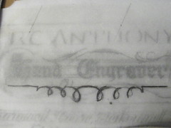 Laters |
|
#9
|
||||
|
||||
|
The Music: Melvynn Braggs 'In our time' Podcast, Beta Band, Imogen Heap
The Drink: H2O (Detoxing from Caffeine substance abuse) The Weather: Sunny/Raining/Sleet. who cares - my toes are frozen. Winter has set in The Mood: Glad that it was cold enough to wear my new woolly hat. It's purple with a Massive pom pom on top. OK, so apologies for dropping out of sight for a few weeks. Its been very busy preparing for Christmas fairs and in-between I went to Scotland to work with an engraver there, which was good fun. So lets get to it: Drawing/Pointing on. (NOTE _ by drawing on I mean drawing with a point through the paper to leave a plascticene film of my drawing/lettering, by Pointing on I mean drawing with the scribe directly onto the metal) So I skipped a step. I left the flourishes and just pointed the lettering on to the copper plate. I just havent had time to work out a cool flourishy design, and am going to work on it before/during engraving. At this point photography becomes a bigger challenge so forgive the poor quality photos.  First I polished the copper plate with brasso and then I got my paper sketch, rolled plascticene all over the back and stuck it on top of my copper plate. It is important that it doesnt shift around or stuff gets blurry 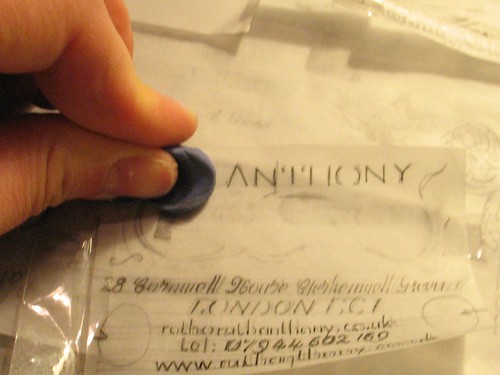 Then I just drew over my lettering drawing with my scribe, using dividers to check the centres and line spacing. NB if doing a print check your image is going on reversed rather than pointing the whole thing on first and then realising it has to go on back to front (ahem. I made this mistake) Checking the centres  Checking the letter height 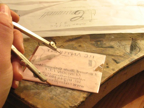 I lifted up the paper to check that the lines were marked on straight and the letter heights were correct (check by eye or with dividers if necessary) 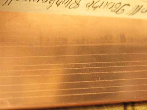 Then I drew the lettering on line by line tracing over my drawing. I was worried about smudging so I drew one line at a time and then pointed it on with the scribe before moving on to the next line. 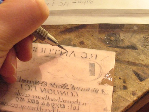 Then I drew it on with my scribe and here, more or less visible, is the result. 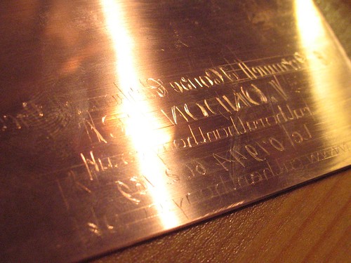  So that was a quick one just to get me on track. I REALLY hope I can get this finished before the deadline, but even if I dont I will finish it eventually. More soon! |
|
#10
|
||||
|
||||
|
I've decided that this tutorial is getting too long, so I'm starting a new one to cover the cutting.
see you there Ruth |
 |
| Bookmarks |
|
|