
|
The Internet's Largest and Fastest Growing Engraving Community
Discuss hand engraving using basic to the most advanced methods and equipment
Forum Members: 14,774. Welcome to our newest member, Chuck Norris
EngravingForum.com -
Domain since Feb 7, 2003
 Graver Video Conferencing is empty Join now!
|
|||||||
| ENGRAVING TOOLS - Paypal accepted | Classes | Glossary | Feedback | Tips | Sharpening | Bulino | Videos | Forum Policies |
 |
|
|
Thread Tools |
|
#1
 01-07-2007, 04:35 AM
|
|||
|
|||
|
here is my last practice plate.
i put a lindsay graver for size. 

|
|
#2
01-07-2007, 06:41 AM
|
|||
|
|||
|
I am just a beginner, so bear that in mind. Overall, very nice. The cuts are reasonably clean and even, but not pro quality. To be honest, the main thing that strikes me is that the scrolls, or volutes, whatever they are called, have no life. The leaves are shaded pretty well, but the shading in the scrolls is too uniform, and something needs to be done to bring life to them. Maybe continue the curl in the volute, into the body of the scroll, and let the shading fade as it leaves the upper portion. That said, it's better than I can do. Hope you don't mind the critique, but that's the way I see it.
|
|
#3
01-07-2007, 06:52 AM
|
|||
|
|||
|
thanks lrb:thumbsup:
|
|
#4
01-07-2007, 09:00 AM
|
||||
|
||||
|
Hi Jacques, It shows you have a nice light touch on the shading!! Also nice clean looking cutting! LRB is correct though, what would help with the shading 3d look is to take the shading deeper as the lines go into the root part of the leaves. In other words, vary the width of the shading cuts more. What you're doing looks similar to what I was doing when I started... and that is making the shading lines narrow the whole length...and this is actually harder to do than varying the depth a little. I went hunting for a pic that might show this. Here is one:
Steve PS..Although nothing wrong with the way you have it shaded now. Looking very good!  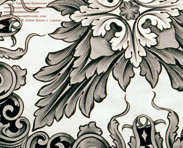
|
|
#5
01-07-2007, 09:55 AM
|
|||
|
|||
|
thanks steave.i am getting mr smiths books on scrolls next week and looking foward to it a lot,i am sure that thay would light up the driveway for me,as for now its all darkness.i dont have a clue as to the what where and why in scroll design.
 forgot to say that the main focus was backround removal on this plate as i had i nightmare with te last one. forgot to say that the main focus was backround removal on this plate as i had i nightmare with te last one.
Last edited by jacques herbst; 01-07-2007 at 10:06 AM.
|
|
#6
01-07-2007, 10:02 AM
|
||||
|
||||
|
I think where most people fall down in this respect is that they forget to look at real live leaves. Hence the mechanical look. The art of scrolls evolved from plants.
Sometimes it's better to stop and smell the roses before you attempt to engrave one. This holds true for everything. There is a beautiful symetry in plant life which can be easily overlooked when transferred to a drawing by the untrained human eye. Jacques - if I were to make one suggestion it would be that you attempt to incorporate native plant life into your scroll design forthe time being. That way you will have something real to look at. Once you have mastered replicating the imagery of a live plant you can stylize it and turn it into a scroll. when I was cutting tusks with scenes of africa I used african plants and wildlife - not scrolls. You have so much more there to work with than we do here in the big cities take advantage of it.
__________________
CoinCutter
|
|
#7
02-19-2007, 01:16 PM
|
||||
|
||||
|
The reason things look dead are because all of your cuts are the same line width and you are not rolling the graver over on the flair outs.
Start your line - it will be narrow. Increase peddle and lay graver over going into flair and then throttle back on the way out. Ie you dont need as much power cutting the line only. Look at the pics of Steves cut and you will see the varience in line width. Do the same. It might help to do this without a ring light so you can see the effects of the graver. Ring lights tend to flatten everything. Hope this helps Otherwise consider this - you have made more progress in a few month than anyone i have seen in a long time. Your cutting looks real good other than the lack of dimension you are seeking to achieve. It will take you no more than 5 minutes to master this technique.
__________________
CoinCutter
|
|
#8
02-19-2007, 04:16 PM
|
||||
|
||||
|
Good comments.
Jacques, the scroll drawing book should help, and you should spend at least as much time drawing, if not more, as you do cutting right now. You are progressing very well in the handling of the tools. The main problem with this last piece is the over all design. Look at how much better your practice plate is looking on the other thread. You are the same engraver when you do that, right? It is the design that is different! As the tools and related gear gets more and more sophisticated, the design aspect will still be the great opportunity for making one's work stand above the crowd. I think Meek said or quoted that "excellent design and poor cutting will beat excellent cutting and poor design." or something vaguely similar to that! You are really moving along well! Tom
|
|
#9
06-11-2008, 08:26 PM
|
||||
|
||||
|
jauques, Although you got some good criticism, you have pretty good layout and design or composition and the size is small so that makes it harder, You are well on your way so keep heart and forge forward,
Neil:yesnod:
|
|
| Bookmarks |
|
|


